Share this article


In 2016, when the National Trust acquired the miniature of Lord Herbert of Cherbury, the picture was sent to the Hamilton Kerr Institute, the painting conservation department at the Fitzwilliam Museum. There, the miniature’s condition was thoroughly assessed, and necessary conservation treatment was undertaken.
The miniature also underwent extensive technical investigation at the Hamilton Kerr Institute, at The Fitzwilliam Museum and at the Victoria & Albert Museum in London, using a non-invasive protocol similar to that typically employed for the investigation of manuscript illuminations. [1]
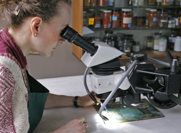
Consolidation under magnification is undertaken on the miniature at the HKI.
© The Hamilton Kerr Institute
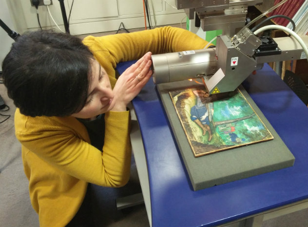
The setup for non-invasive XRF analysis undertaken at the Fitzwilliam Museum
© C.S. Kimbriel
Once the analysis had been completed, the miniature was sealed in between two sheets of glass and reframed to protect it better from environmental fluctuations, before it finally went back on display. This article presents some of the findings made during the technical investigation and showcases what can be learned when we take a very close look at a picture of this size.
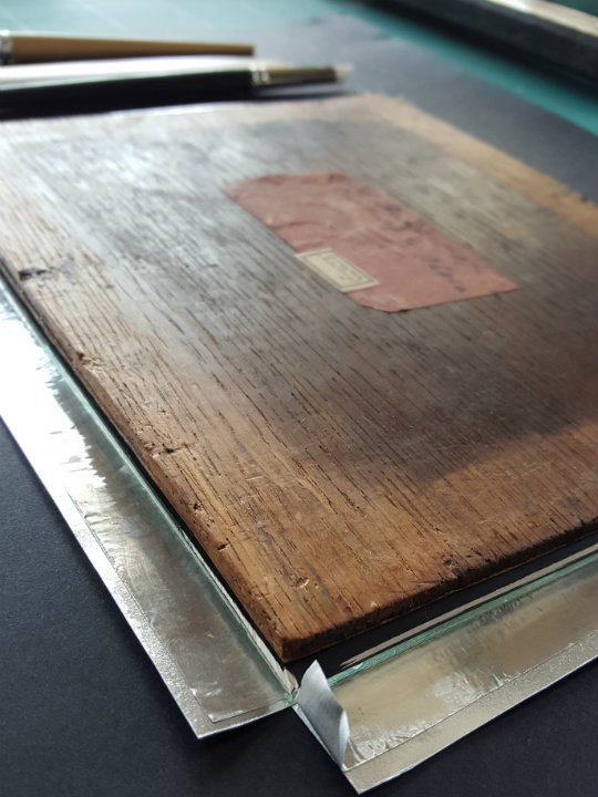
The miniature in the process of being sealed between two sheets of low-reflective glazing
© The Hamilton Kerr Institute
The miniature, in its glazing, being remounted in its frame
© The Hamilton Kerr Institute
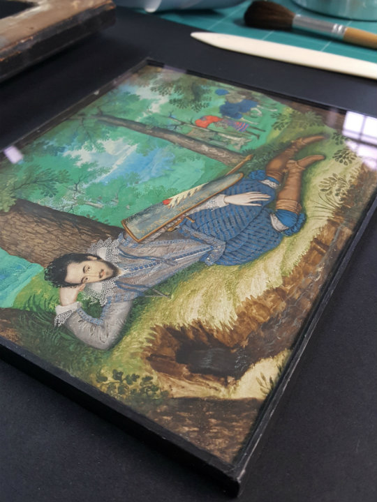
The 'cabinet' miniature in context
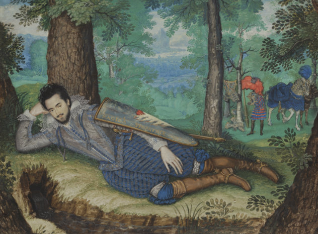
Lord Herbert of Cherbury, lying by a brook in a wooded surround, is a rare example of a 'cabinet' miniature. While the early English portrait miniature is a rare art form, this larger format and expanded composition is even rarer. The introduction of the full-blown landscape setting to the subject-matter of English miniature-painting is thought to have been Isaac Oliver's. [2].
Much of what we know about 16th-century miniature painting is derived from contemporary treatises. Sadly, no written documentation survives from Isaac Oliver’s hand, but Oliver's teacher, Nicholas Hillard, divulged much information on the materials and techniques of miniature painting when he wrote A Treatise Concerning the Arte of Limning in around 1600.
The binding medium and the application of paint
According to Hilliard and other contemporary sources, the binding medium used for miniature painting is gum arabic. Sometimes, dissolved sugar candy is added, which influences the drying properties and appearances of certain colours. The tempering of the colours and the consistency with which they are applied is paramount, as is the order in which passages are painted. The fine vellum support is not as absorbent as paper, and there is little scope for wet-in-wet modelling and very limited leeway for corrections. Layering of paint therefore has to be very carefully executed, and the order of painting must start with lean and end with more bodied applications.
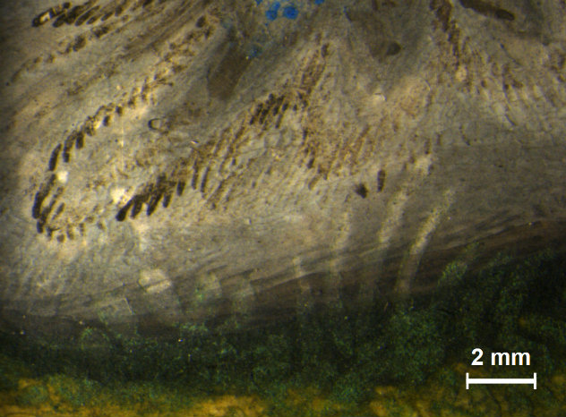
A closer look in raking light at the miniature reveals how the painter certainly mastered the challenging techniques required. For example, the minty greens of the compositional middle-ground consist of coarsely ground, mineral green pigments that had to be ‘floated’ into place. This means that a quick, thin application of paint was done first in order to wet the passage, and then a loaded brush was used to deliver the granular paint, which, facilitated by the pre-wetted surface, should proceed to spread out into an even layer.
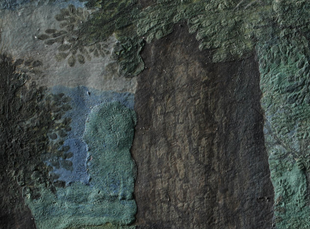
Raking light reveals how cool green landscape elements in the middle-distance have been floated in to abut the forgeround tree trunk
© National Trust / The Hamilton Kerr Institute
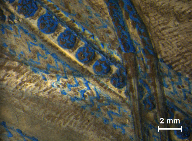
Raking light shows the textured surface achieved with more bodied paint in the blue hoses
© National Trust / The Hamilton Kerr Institute
The pigments
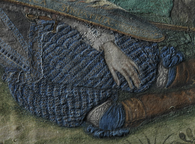
Other features can likewise be appreciated better in raking light, such as the highly refined pattern on the blue hoses. The basic modelling of the blue fabric was first done with azurite, another mineral pigment which, similar to mineral green, is challenging to paint out. [3]
Black shading to indicate the folds of the voluminous fabric followed, before the diagonal grey bands were added on top. These were further embellished with zigzag-lines in thick, azurite blue. As the final touch, silver paint, which has now tarnished to black, was applied to create highlights on the grey bands, affecting a sparkle suggestive of silver-thread. The painter also placed silver highlights on Lord Herbert’s doublet and sleeves, thereby giving the impression of a rich, pale grey, silk fabric.
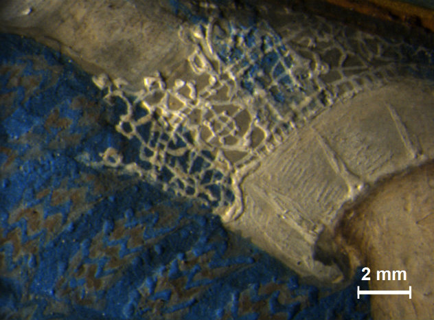
Micrograph showing the detailing in the hoses and the lace cuff
© National Trust / The Hamilton Kerr Institute
Micrograph of the tarnished silver highlights on the proper right sleeve
© National Trust / The Hamilton Kerr Institute
Compositional changes
As deliberate as the overarching lay-out and the detailing in the costume are, two compositional changes were nonetheless made at a rather late stage in the painting process. First, a blue scabbard is disguised in the grass behind Lord Herbert. It has become more visible again over time due to subtle loss occurring in the granular, green paint on top.
A blue scabbard, disguised by the grass painted on top, is present behind Lord Herbert's left boot
© National Trust / The Hamilton Kerr Institute
Second, the x-ray also shows how a diagonal line, belonging to a previous version of this passage of the composition, runs across the chest. The artist subsequently attempted to disguise it and partly succeeded, but one can still see it on close inspection.
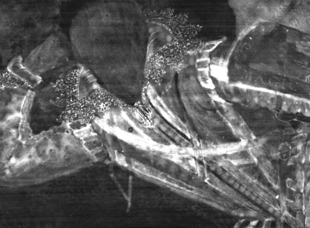
X-ray detail showing a curved diagonal across Lord Herbert's chest, which appears to be a sword strap that was subsequently painted out
© National Trust / The Hamilton Kerr Institute
Micrograph showing the pale line of the sword strap beneath the carefully executed detailing on the grey doublet
© National Trust / The Hamilton Kerr Institute
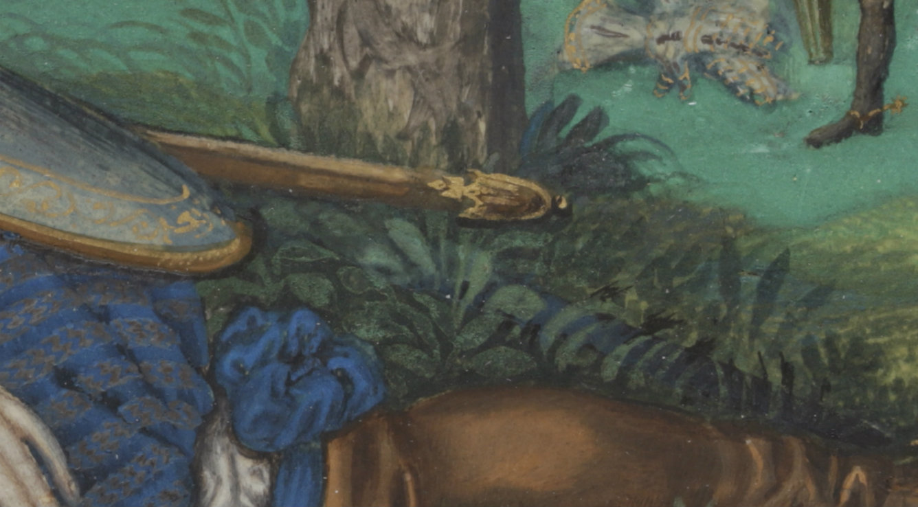
The feature appears to have been a sword strap, which may have been replaced by the sword belt. The final rendition of the sword depicts it sitting in a brown, gold-tipped scabbard attached to the belt, and placed a little awkwardly under Lord Herbert’s arm. This change of heart is noteworthy and deserves to be seen as significant in light of the carefully orchestrated symbolism of the composition and its various details. Could the commissioner himself have requested it as a means to emphasise subtly how, even in his contemplative state, he is ready at arms?
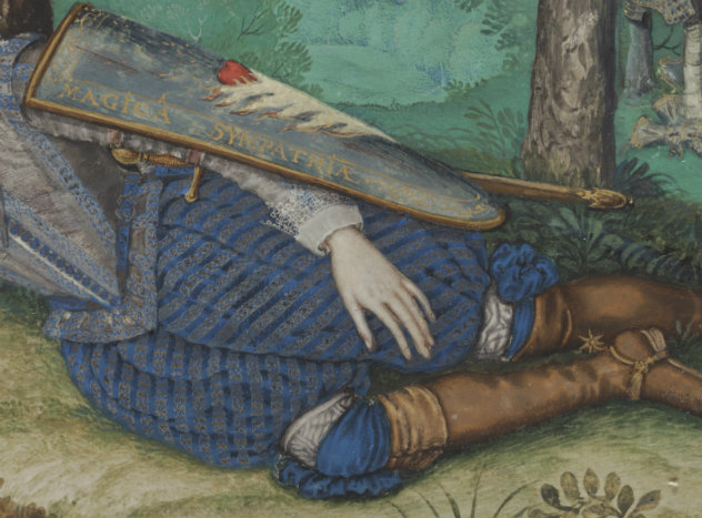
The final rendition of the sword depicts it sitting in a brown, gold-tipped scabbard attached to the belt, and placed a little awkwardly under Lord Herbert’s arm
© National Trust / The Hamilton Kerr Institute
Fluorescence
Another passage of symbolic significance is the embellished shield with the emblem of a heart engulfed by white flames. Examination of the miniature under ultraviolet light shows the presence of a strongly fluorescing material in this part of the picture. Under magnification it is evident that a medium of sufficient thickness to exhibit vertical craquelure lines is present, and this medium is likely to be the cause of the fluorescence. [4]
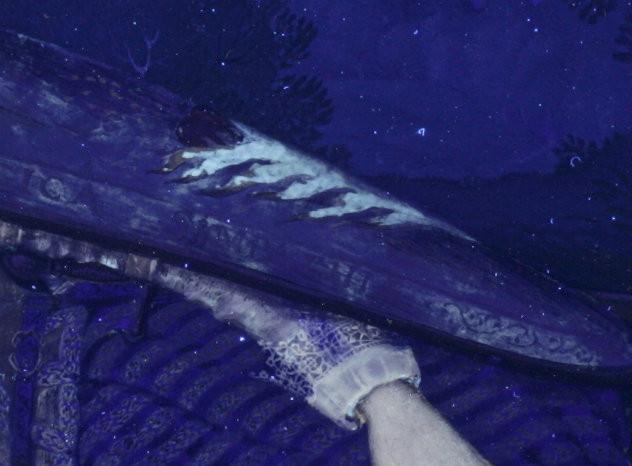
UV light image showing how the flames on the shield fluoresce
© National Trust / The Hamilton Kerr Institute
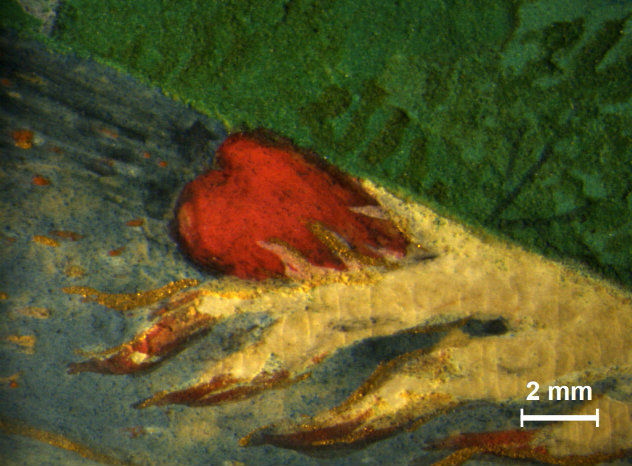
Micrograph of the emblem on the shield showing vertical cracks in the medium-rich paint of the flames
© National Trust / The Hamilton Kerr Institute
The present colour of the flames suggests that they may have been painted using mainly a white pigment. XRF analysis indicated the presence of lead and tin however, which is suggestive of the pigment lead-tin yellow – a pigment that can range from a relatively intense yellow to quite a pale hue. [5]
FT-IR analysis was done on this passage in order to learn more about the fluorescing material, and the result indicated the presence, not of a gum, but of a proteinaceous material. While Nicholas Hilliard only mentions gum in his treatise on miniature painting, earlier manuscripts also list glair (whisked egg white) to be used with certain pigments, such as with the yellow lake derived from saffron. [6] It is thus conceivable that the flames were in fact initially more yellow, effected by the application of a yellow lake bound in glair. However, as lakes are fugitive pigments, the passage would have been particularly susceptible to fading.
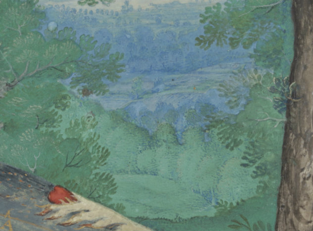
Detail of the landscape showing the subtle differences between the cool, mineral greens used for trees and foliage
© National Trust / The Hamilton Kerr Institute
The binder
The analysis shows that the artist did not limit himself to a gum-binder, and it is even possible, considering the thickness of the proteinaceous layer, that it would have been glossier than its surroundings when first applied. It is questionable whether Hilliard would have approved of such an effect, considering that he warns against using excessive gum medium, which will render a colour ‘some what bright lyke oil callour [colour], wch is vylde [vile] in limning’. [7] The only elements with a glossy appearance would thus have been the tiny jewels, which Hilliard created using a tinted resin over silver. [8]
While the cool greens of the landscape may look highly homogenous, analysis showed that the subtle visual differences are, at least in part, due to the fact that two different copper-based minerals were employed: the commonly employed green pigment malachite (a copper carbonate), and brochantite (a copper sulphate), which is much less frequently identified. [9]
FT-IR analysis also suggested that an unusual binder may have been used for these thick, green paint passages, as the spectra obtained were not indicative of gum or glair, but of a lipid. While more comparative studies are necessary to draw conclusions, it could be indicative of egg yolk, perhaps used for its visual impact in warming up the cool tone of the green. [10] Alternatively, it may have had a beneficial impact on the workability of the granular green paint.
As the majority of early miniatures are bust-length portraits on monochrome blue backgrounds, expansive green passages are in fact quite rare. It is therefore not implausible that the present artist, who chose to break with Hilliard’s stricter tradition by expanding on both the size and subject matter as exemplified in the Powis miniature, would also have made use of a wider range of materials and methods. Indeed, another example of this can be found in the distant mountainous features, where a faint, carbon-based dry-point drawing can be seen beneath the paint layers. The laying in of compositional features in this way is again a method that is absent from Hilliard’s treatise, which only describes delineating facial features of sitters with a red lake paint.
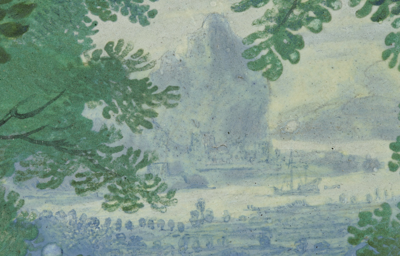
Detail of the distant landscape, where faint underdrawing can be discerned in the mountainous features
© National Trust / The Hamilton Kerr Institute
Conclusion
In conclusion, the technical examination of the miniature of Lord Herbert, in his simultaneous guise as brave knight and melancholic thinker, has revealed how technical skill, meticulous use of a wide range of pigments, and particular attention paid to the finishing touches were combined in the creation of a work of art, which would have been worthy of its larger-than-life sitter.
Notes
[1] It would be logical to assume that the word 'miniature', adopted to categorise minutely detailed portraits housed in lockets usually made of metal or ivory, was an apt term referring to their diminutive size. But it would in fact be incorrect, as the term ‘miniature’ derives from ‘minium’, the Latin word for the red, lead-based pigment employed for the enlarged initials on early illuminated manuscript pages. That the portrait miniature as a genre grew out of the tradition of manuscript illumination is also directly evident in that, materially and technically, they are fundamentally identical.
Manuscript illuminations have been the subject of extensive, non-invasive technical investigation at the Fitzwilliam Museum in Cambridge since 2012, under the aegis of the MINIARE project.
[2] See Roy Strong, The English Renaissance Miniature, Thames and Hudson, 1983, p.156.
[3] Azurite, a blue copper carbonate mineral, progressively loses its colour intensity the finer it is ground and will turn increasingly grey. The painter would therefore have needed to balance the desired appearance with the workability of the paint.
[4] X-ray fluorescence measurements were carried out with a Bruker Artax micro X-ray spectrometer with a rhodium anode.
[5] Fourier-Transform Infrared Spectroscopy measurements were carried out with a Bruker ALPHA infrared spectrometer in external reflection mode.
[6] See for example the instructions in the heraldic painter John Guillim’s Vade Mecum. See Jim Murrell, ‘John Guillim’s Book: A Heraldic Painter’s Vade Mecum’, Walpole Society, 57 (1993-94), p. 14. See also the discussion on the use of gum and glair in Edward Norgate, Minatura or the Art of Limning, J. M. Muller and J. Murrell, eds, Yale University Press, 1997, p. 127.
[7] N. Hilliard, The Arte of Limning, R.K.R. Thornton, & T.G.S. Cain, eds, Carcanet Press, 1992, p. 90.
[8] ‘…other stones must be glased vppon the Siluer wth their proper cullors wth some varnish &c…’ In: N. Hilliard, op.cit., p.98.
[9] Although the minerals malachite and brochantite can occur together, they were found not to be present in the same paint passage. They thus appear to have been employed deliberately for distinct passages, quite likely due to their subtly different tones. The identification was supported by XRF, FORS, FT-IR and Raman analysis. The distinction between different copper-based greens using non-invasive analytical methods has not been pursued in great depth, and brochantite paint layers may therefore be more common than has yet been appreciated (see B. Gilbert, S. Denoel, G. Weber and D. Allart, ‘Analysis of green copper pigments in illuminated manuscripts by micro-Raman spectroscopy’, Analyst 128, 2003, 1213-1217. See also G. Bertolotti and P. Ricciardi, 'Painting materials in sixteenth-century Flemish illumination, with a focus on the use of copper sulphates: Simon Bening as a case study', in S. Panayotova and P. Ricciardi, eds., Manuscripts in the Making: Art and Science, vol. 2, Harvey Miller/Brepols, 2018, pp. 116-129).
[10] The idea that an egg yolk addition affects the colour and hue of paint layers is expressed for example in Cennino Cennini’s treatise on Italian painting techniques, written around the year 1400. In this work, the author instructs his reader to add an egg yolk to the uppermost, azurite blue paint layers when painting the Virgin’s mantle (in wall paintings). In fact, if the blue pigment is a little pale, he specifically recommends using a yolk from a farm egg for its superior intensity of colour. See L. Broecke, Cennino Cennini’s Il libro dell’arte: A New English Translation and Commentary with Italian Transcription, Archetype Publications, 2015, p. 120.
Share this article